Post Sale Charts/Reports
The Post Sale Reports/Charts component provides data analysis and visualization for previous lease sales. The reports highlight company and gulf wide behavior (i.e. oil prices, money exposed, number of bids, solo vs. group participation, etc.) for a range of sales or a specific sale going back to 1983.
A total of 4 types of compiled charts can be chosen:
(1) Individual company charts for a single sale
(2) Individual company charts for sales within a specified time range.
(3) All companies charts for a single sale.
(4) Gulf-wide charts for sales within a specified time range.
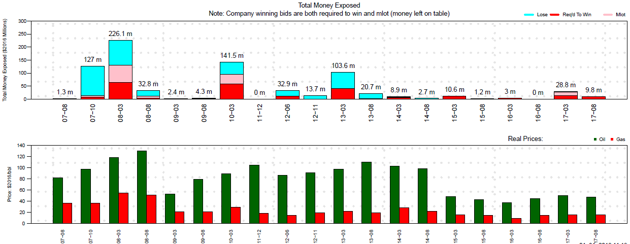
Once the chart type is chosen and the companies/dates are entered, a zip file is emailed containing a pdf of the compiled charts. Most charts are straightforward, such as this one displaying the amounts bid for a single company along with the prices of oil and gas for comparison.
Some of the more complex charts include:
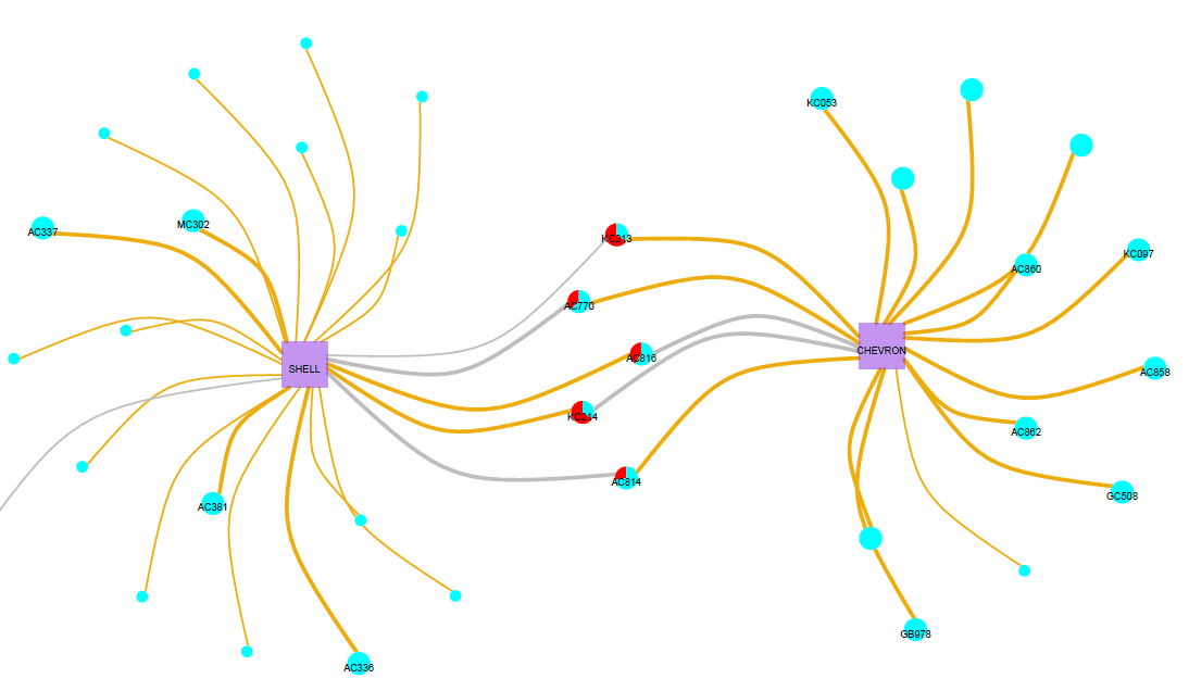
(1) Visual display of the activity for a specified sale: Network graph showing the relationships and results of all company bids (i.e. all companies participating as a solo bidder or in a group, the number of blocks won and lost, money left on table). This example is the part of the graph showing competition between Chevron and Shell in sale 249. Gold lines indicate winning bids and the red portions of the pie charts are the portions of the bids representing ‘money left on the table’ beyond the second highest bid.
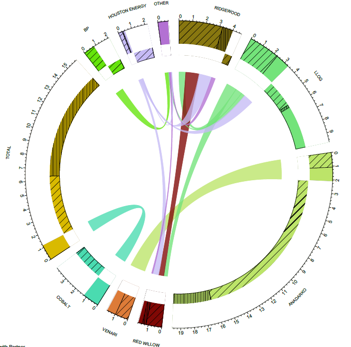
(2) Relationship of the top group participation for a specified sale: Circular plot linking the top companies participating in groups characterized by the total bid amount won, lost, and left on table. This example shows all companies that partnered in sale 247. The lines in the center connect the partners and the widths of those lines represent the portion of each company’s bids that were partnered with the company on the other end of the line.