AskSmart Mapping
Overview
AskSmart is an AI powered interface to extend GOMsmart beyond its original functionality. By simply asking questions, AskSmart can build a customized map...
Input
The interface is straightforward: Enter a question for AskSmart to answer. It will determine the best way to answer the question and ask for more...
Output
AskSmart generally answers in one of four ways: Directly answering a question conversationally, gathering data and presenting a table...
Tools
The interface contains a series of tools to build and explore the map...
Overview
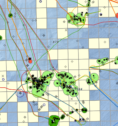
AskSmart is an AI-powered assistant to help compile and analyze GOMsmart data by typing simple English questions or requests. Using AskSmart, you can build a customized map specific to your needs. With this interface, you can filter leases to a specific company, change colors thematically and analyze the map's tabular data interactively. It expands the capabilities of mapping within GOMsmart far beyond the far more static original map.
There are also a few tools to help explore the map.
Input
The interface is straightforward: Enter a request for AskSmart to create and modify a map. Each request can be built upon the last or evaluated as a new question. For example:
- Create a map of leases owned by Shell.
- Load wells that have produced.
- Show wells that produced in the Lower Pliocene and make them blue.
- Color the leases by status.
- Show active platforms.
- Label the paleo by observation.
- Select wells in Alaminos Canyon that have produced more than 100,000 bbls of oil.

Output
The map will automatically update based on your requests. These functions include adding/removing data, changing colors, filtering data, labeling data, highlighting data (making selections) and turning data on and off.
Tools
The interface contains a series of tools to build and explore the map.
- On the top left are buttons to zoom in and out. The scroll wheel on the mouse can also be used to zoom. Holding the shift key while drawing a box with the mouse will zoom to that extent.

- The second button on the left generates a file to print. This can include a title block or just an image of the map.

- The third button on the left manages the loading of the map. If you need specific layers of data and customize the map's colors or labels, this is an excellent way to save the map to always display the same way. It can be updated here or reverted to the default map.

- The last two buttons on the left control selecting features in the map. This will highlight the selected data so that it can be exported from the table. The trash can button will clear the selection.

- Working down from the top right, the first button presents a list of all of the various layers that can be added to the map.

- The next button presents the data that is currently loaded in the map. These can be dragged up and down for their drawing order. The visibility can be toggled on and off and they can be removed.

- The third button presents the legend of each layer in the map.

- The fourth button presents various basemaps to use as a backdrop to the map.

- The fifth button pops up after clicking an item in the map. It shows all of the layers and specific features that were clicked. From there, it will jump to a page to access reports, charts, well logs, etc., depending on the dataset.

- The last button, on the lower left, opens the tabular data for the selected dataset that is in the map. Records can also be selected here to export.